Dallas Crime Predictions
My largest foray to-date into the world of Data Science and Machine Learning to answer real-world questions about the type and frequency of crime occuring in the City of Dallas.
The Motivation and Objective
Given my recent fascination with training machine learning models, I have begun looking for applications to use them everywhere in my personal life. This project idea came to life quickly after an unfortunate incident on the very street I live on. I quickly realized my local Police Department could certainly benefit from having more information - and more importantly - more easilcy accessed and understood information at their fingertips. Thus the motivation was born. The objective was simple: To understand the types and scale of data made available by the City of Dallas and see if I could use any of it to understand the where and when of crime in the city. And as an added bonus, I was going to attempt to train a machine learning model on the data to see what may come of it.
My Role
In the interest of transparency, I must note that this project is of entirely my own motivations and volition. I have not partnered with any person or institution to gather, process, or interpret the data used in this prooject.
The Data
The data for this project came directly from the Dallas Police Public Data site located here. At time of writing, this data set consists of 861,000 rows and 86 columns at approximately 804mb in size. If you are interested in downloading this dataset for yourself, and do not require the most up-to-date data, I have archived a full copy of the data set here on my server to prevent excessive resource usage for the City of Dallas. Download this here in csv format.
With a dataset of this size, a substantial amount of cleaning had to be done. The largest amnount of cleaning occurred as a result of deleting duplicate rows for the same crime incident. The way data is entered into this spreadsheet, if multiple "units" or responding officers are assigned to an incident, another row is created with no further information other than the responding officer's badge number and patrol car. During Exploratory Data Analysis, EDA, it became clear that good records weren't kept until mid-2014, so I then dropped any rows prior to 2015. Luckily for me, Latitudinal and Longitudinal coordinates for the crimes were included in one columnn of the spreadsheet. I broke these out into separate columns for ease of use later on.
Plotting & Graphing
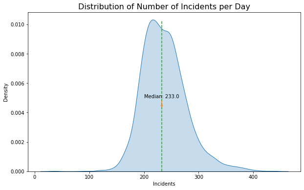
With the data cleaned, the next step was to understand more about what I was looking at. The plot on the right shows the distribution of incidents per day, the median of which is 233.
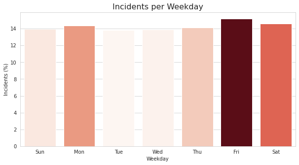 The plot on the left shows the incidents per weekday as a percentage of the total. As we can see, Friday and Saturday are slightly higher than the rest of the week days. What surprised me here was the consistancy across days; I really thought Friday and Saturday would take up more of the lion's share of crime for the week.
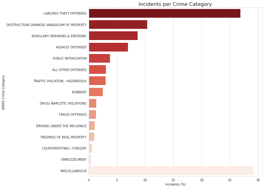
I next wanted to understand the types of crime that were occuring. To do this I had to learn how crime was even reported in the first place. It turns out there are multiple systems used. The first I encountered was the UCR, or "Uniform Crime Reporting" Program by the FBI. Its purpose is to generate reliable statistics to law enforcement. However, after looking at my dataset, it seemed like it would be much easier to use the NIBRS, or National Incident Based Reporting System, to classify and categorize the types of crime occuring. The figure on the right shows the 15 most committed crimes.
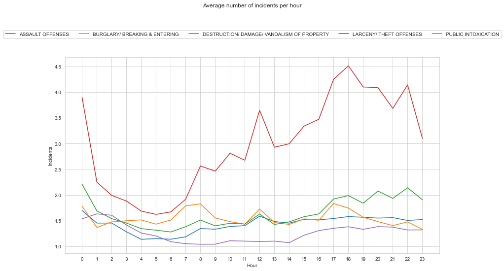
Digging into the data a little further, I plotted the most committed crime based upon the hour it was committed. I think it comes as no surpise that theft offenses tend to occur moreso in the dark hours.
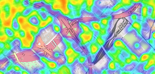
These graphs are great, but here is one of the best things to come from this project. I have taken the latitude and longitude data, and plotted that on an interactive map of the City of Dallas. Feel free to check it out below. You can search with a specific Dallas address using the eyeglass button on the left. For example, try inputting the address to city hall: 1500 Marilla St, Dallas, TX 75201.
Machine Learning
Now we get into the meat of the project. I've cleaned and explored the data, now its time to see what inferences and predictions can be made using Machine Learning! I selected my target to be "NIBRS Crime Category" and separated it from the features. I label encoded categorical features such as Police "Division". I split my data set into test and train data, and selected the model "LGBMClassifier." The reason for doing so is mostly that I was already familiar with this model from other projects. I have o doubt that there is likely a more scientific way of determining the best model for a data set. The last step was to fit the data and make predictions. The way I've set this problem up is that we are making predictions on when the different types of crime may occur given the hour of the day. Obviously, this is easy enough for us to do given the existing data we already have, but this also makes it easier to ensure our model is giving us the expected results. Currently, the model is able to accurately predict the hour of the crime based on the type of crime approximately 60% of the time. So in other words, my model is more likely than not to be correct. This really isn't anything to right home about. But its a good first effort. Generating PDP plots helps to confirm some of the accuracy. Below is a sampling of these plots that were generated.
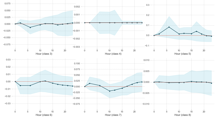
The different classes correspond to the different crime categories that were assigned a number due to my label encoding. Here is the key for the classes shown above:
'ASSAULT OFFENSES': 3, 'BRIBERY': 4, 'BURGLARY/ BREAKING & ENTERING': 5, 'COUNTERFEITING / FORGERY': 6, 'DESTRUCTION/ DAMAGE/ VANDALISM OF PROPERTY': 7, 'DISORDERLY CONDUCT': 8Conclusion
And thats pretty much it for now! We can successfully predict the hour different crimes will occur within the City of Dallas with about a 60% accuracy rate! This project is far from over though. My next steps will include fitting new models to the data, further reducing the data size to filter out unimportant or inconsequential features, and adding in better logic for predicting hour of crime based on geographic location within the city.
Below is a full copy of the script as it exists at time of writing. As always, check my Github repo here for the latest code and the supporting files.
"""
Dallas Crime Predictions
Oct 28th 2021
Austin Caudill
"""

########## Begin Imports ##########
# Begin Timer for script
import time
start_time = time.time()

import pandas as pd
import seaborn as sns
import matplotlib.pyplot as plt
from matplotlib import cm
import geopandas as gpd
import numpy as np
import folium
from folium import plugins
import lightgbm as lgbm
import eli5
from eli5.sklearn import PermutationImportance
from lightgbm import LGBMClassifier
from pdpbox import pdp
import shap
from sklearn.preprocessing import LabelEncoder
from sklearn.model_selection import train_test_split
from sklearn.metrics import accuracy_score

print("Imports Loaded Successfully.")
########## END Impots ##########

########## Read-In Data & Process ##########
data = pd.read_csv("Police_Incidents.csv", parse_dates=['Time1 of Occurrence', 'Date1 of Occurrence', 'Year1 of Occurrence'])

# Rename columns for ease of use.
data.rename(columns={'Date1 of Occurrence': 'Date'}, inplace=True)
data.rename(columns={'Year1 of Occurrence': 'Year'}, inplace=True)

# Good records weren't kept until mid-2014, so only want to keep records for subsequent years.
data = data[data.Year >= "2015"]

# Check to ensure records were removed.
#print('First date: ', str(data.Date.describe(datetime_is_numeric=True)['min']))
#print('Last date: ', str(data.Date.describe(datetime_is_numeric=True)['max']))

# Check for duplicate records.
print('Number of duplicate records: %s'  % (data['Incident Number w/year'].duplicated().sum()))  # Someday should convert to ftsring format.
# sorting by incident-year
data.sort_values("Incident Number w/year", inplace = True)
# dropping ALL duplicate values
data.drop_duplicates(subset ="Incident Number w/year",
                     keep = False, inplace = True)
print('Number of duplicate records: %s'  % (data['Incident Number w/year'].duplicated().sum()))  # Check again
# Duplicates have been removed.

# Need to extract Lat and Long from column: Location1
data['Lat_and_Long'] = data['Location1'].str.extract(r'\(([^)]+)')
# Now need to split into seperate columns and store in dataframe
temp = data['Lat_and_Long'].str.strip('()').str.split(', ', expand=True).rename(columns={0:'Latitude', 1:'Longitude'})
data = pd.concat([data, temp], axis=1)
# To free up memory:
del temp

########## Data Analysis Plots ##########
# Analyzing number of incidents per day
col = sns.color_palette()

plt.figure(figsize=(10, 6))
dates = data.groupby('Date').count().iloc[:, 0]
sns.kdeplot(data=dates, shade=True)
plt.axvline(x=dates.median(), ymax=0.95, linestyle='--', color=col[2])
plt.annotate(
    'Median: ' + str(dates.median()),
    xy=(dates.median(), 0.004),
    xytext=(200, 0.005),
    arrowprops=dict(arrowstyle='->', color=col[1], shrinkB=10))
plt.title('Distribution of Number of Incidents per Day', fontdict={'fontsize': 16})
plt.xlabel('Incidents')
plt.ylabel('Density')
plt.show()

# Analyzing number of incidents per year
plt.figure(figsize=(10, 6))
years = data.groupby('Year').count().iloc[:, 0]
sns.kdeplot(data=years, shade=True)
plt.axvline(x=years.median(), ymax=2, linestyle='--', color=col[2])
plt.annotate(
    'Median: ' + str(years.median()),
    xy=(years.median(), 0.004),
    xytext=(200, 0.005),
    arrowprops=dict(arrowstyle='->', color=col[1], shrinkB=10))
plt.title('Distribution of Number of Incidents per Year', fontdict={'fontsize': 16})
plt.xlabel('Incidents')
plt.ylabel('Density')
plt.show()


byday = data.groupby('Day1 of the Week').count().iloc[:, 0]
byday = byday.reindex(['Sun','Mon', 'Tue', 'Wed', 'Thu', 'Fri', 'Sat'])
plt.figure(figsize=(10, 5))
with sns.axes_style("whitegrid"):
    ax = sns.barplot(
        byday.index, (byday.values / byday.values.sum()) * 100,
        orient='v',
        palette=cm.ScalarMappable(cmap='Reds').to_rgba(byday.values))
plt.title('Incidents per Weekday', fontdict={'fontsize': 16})
plt.xlabel('Weekday')
plt.ylabel('Incidents (%)')
plt.show()


byincident = data.groupby('NIBRS Crime Category').count().iloc[:, 0].sort_values(ascending=False).head(15)
byincident = byincident.reindex(np.append(np.delete(byincident.index, 0), 'MISCELLANEOUS'))
plt.figure(figsize=(10, 10))
with sns.axes_style("whitegrid"):
    ax = sns.barplot(
        (byincident.values / byincident.values.sum()) * 100,
        byincident.index,
        orient='h',
        palette="Reds_r")
plt.title('Incidents per Crime Category', fontdict={'fontsize': 16})
plt.xlabel('Incidents (%)')
plt.show()

# Mapping Lat and Long points - Not useful due to amount of points plotted.
long_min = -97.0690
long_max = -96.4593
lat_min = 33.0333
lat_max = 32.6006
BBox = (long_min, long_max, lat_min, lat_max)
Dallas_Map = plt.imread("Map_of_Dallas.png")
fig, ax = plt.subplots(figsize = (8,7))
data['Latitude'] = pd.to_numeric(data['Latitude'])
data['Longitude'] = pd.to_numeric(data['Longitude'])
ax.scatter(data['Longitude'], data['Latitude'], zorder=1, alpha= 0.2, c='b', s=10)
ax.set_title('Plotting Spatial Data on Dallas Map')
ax.set_xlim(BBox[0],BBox[1])
ax.set_ylim(BBox[2],BBox[3])
ax.imshow(Dallas_Map, zorder=0, extent = BBox, aspect= 'equal')

# Heatmap by Lat/Long points
print('All Crime')
heatmap_data = data[['Latitude', 'Longitude']].dropna()
heatmap = folium.Map([32.7767, -96.7970], zoom_start=11)
heatmap.add_child(plugins.HeatMap(heatmap_data, radius=15))
display(heatmap)
del heatmap_data # To conserve resources

##########################################
# Geographic Density of Different Crimes
crimes = data['NIBRS Crime Category'].unique().tolist()
for i in crimes:
    print(i)
    heatmap_base = folium.Map([32.7767, -96.7970], zoom_start=11)
    # Ensure you're handing it floats
    data['Latitude'] = data['Latitude'].astype(float)
    data['Longitude'] = data['Longitude'].astype(float)
    # Filter the DF for rows, then columns, then remove NaNs
    heat_df = data[['Latitude', 'Longitude', 'NIBRS Crime Category']]
    heat_df = heat_df.dropna(axis=0, subset=['Latitude','Longitude'])
    heat_df = heat_df.loc[heat_df['NIBRS Crime Category'] == i]
    # List comprehension to make out list of lists
    heat_data = [[row['Latitude'],row['Longitude']] for index, row in heat_df.iterrows()]
    # Plot it on the map
    heatmap_base.add_child(plugins.HeatMap(heat_data, radius=15))
    # Display the map display(heatmap_base)
    print()

##########################################
########## END Data Analysis Plots ##########

data['Time for Hour'] = data['Time1 of Occurrence'].copy()
data['Hour'] = data['Time for Hour'].dt.hour
data['Time for Min'] = data['Time1 of Occurrence'].copy()
data['Minute'] = data['Time for Min'].dt.minute
data['Time for Mon'] = data['Date'].copy()
data['Month'] = data['Time for Mon'].dt.month
data.drop(columns=['Time for Hour', 'Time for Min', 'Time for Mon']) # These are no longer needed.

data3 = data.groupby(['Hour', 'Date', 'NIBRS Crime Category'], as_index=False).count().iloc[:,:4]
data3.rename(columns={'Incident Number w/year': 'Incidents'}, inplace=True)
data3 = data3.groupby(['Hour', 'NIBRS Crime Category'], as_index=False).mean()
data3 = data3.loc[data3['NIBRS Crime Category'].isin(
   ['LARCENY/ THEFT OFFENSES', 'DESTRUCTION/ DAMAGE/ VANDALISM OF PROPERTY', 'ASSAULT OFFENSES', 'BURGLARY/ BREAKING & ENTERING', 'PUBLIC INTOXICATION'])]
sns.set_style("whitegrid")
fig, ax = plt.subplots(figsize=(14, 8))
ax = sns.lineplot(x='Hour', y='Incidents', data=data3, hue='NIBRS Crime Category')
ax.legend(loc='upper center', bbox_to_anchor=(0.5, 1.15), ncol=5)
plt.suptitle('Average number of incidents per hour')
plt.xticks(range(0, 24))
fig.tight_layout(rect=[0, 0.03, 1, 0.95])
plt.show()

### Machine Learning ###
# Keep only needed columns
newdata = data[['Month','Minute','Hour','Division','NIBRS Crime Category','Year of Incident','Day1 of the Year','Watch','Beat','Zip Code']].copy()
newdata = newdata[newdata.Watch != 'U']
newdata['Watch'].dropna(inplace=True)
newdata['Watch'] = newdata['Watch'].astype(str).astype(int)

# Seperate the target (`y`) from the features (`features`).
y = newdata['NIBRS Crime Category']
features = newdata.drop(['NIBRS Crime Category'], axis=1)

# List of features for later use
feature_list = list(features.columns)

# label-encode categorical columns
X = features.copy()

# Label Encode categorical variables
labelencoder = LabelEncoder()
X['Division'] = labelencoder.fit_transform(features['Division'])
le2 = LabelEncoder()
y= le2.fit_transform(newdata['NIBRS Crime Category'])
# Need key for later reference - Note: These are listed alphabetically.
print(dict(zip(le2.classes_,range(len(le2.classes_)))))

# Split test set from the training data.
X_train, X_test, y_train, y_test = train_test_split(X, y, random_state=1)

params = {'boosting':'gbdt',
          'objective':'multiclass',
          'num_class':39,
          'max_delta_step':0.9,
          'min_data_in_leaf': 21,
          'learning_rate': 0.4,
          'max_bin': 465,
          'num_leaves': 41
         }

model = LGBMClassifier(**params)

# Train the model
model.fit(X_train,y_train)

# Make predictions.
y_pred = model.predict(X_test)

# Determine importance of features used in model.
perm = PermutationImportance(model).fit(X_test, y_test)
display(eli5.show_weights(perm, feature_names=X_test.columns.tolist()))

# Determine model accuracy
accuracy=accuracy_score(y_pred, y_test)
print('LightGBM Model accuracy score: {0:0.4%}'.format(accuracy_score(y_test, y_pred)))

# Create Partial Dependence Plots - Reference dictionary above for classes.
model2 = model.fit(X, y, categorical_feature=['Division'])
y_pred = model.predict(X)
# Determine model accuracy
accuracy=accuracy_score(y_pred, y)
print('LightGBM Model accuracy score: {0:0.4%}'.format(accuracy_score(y, y_pred)))
pdplot = pdp.pdp_isolate(
    model=model2,
    dataset=X,
    model_features=X.columns.tolist(),
    feature='Hour',
    n_jobs=-1)
pdp.pdp_plot(
    pdplot,
    'Hour',
    ncols=3)
plt.show()

########## Select Crime Category Feature Dependence ##########
# "The SHAP values do not identify causality, which is better identified by experimental design or similar approaches."
# I'm not sure the class names are correct
shap_values = shap.TreeExplainer(model2).shap_values(X)
shap.summary_plot(shap_values, X, feature_names = X.columns, class_names= crimes)

########## Finish Script ##########
print("Success")
print("--- %s seconds ---" % (time.time() - start_time))